Type has the unique ability to express an idea visually and simultaneously say it, verbally. Both an explicit statement and an implicit visual, type design has the potential to mean more than the words it spells, reaching far beyond typesetting and magazine spreads. It is this relationship between word and image, and their potential for cognitive disconnect, that gives typography a foothold in the world of contemporary fine art.
The creation of characters has a long history of artistic self-expression – from Chinese calligraphers whose work was (and still is) considered fine art, to the humanist type designers like Geofroy Tory whose work came about during the enlightenment and who was (like many artists of the same time) inspired by the geometry of the human form, to modern-day hand-lettering artists like Job Wouters, (better known as “Letman”).


Amsterdam-based Letman’s hand-lettered work spans industries – from fashion to marketing to animation to art center installations, demonstrating that hand lettering is still relevant. Whereas a good deal of his work references blackletter and traditional sign-making techniques, his collaborators and statements are far from antiquated.


Video above was created by the Walker Art Center during a collaboration and exhibition with Letman.
Jenny Holzer is a contemporary artist whose medium is words. She creates what she has called “truisms”- phrases referencing the human relationship with consumerism and advertising, that she makes into large-scale projections, scrolling LEDs, and works on paper. Holzer’s minimalist aesthetic and an all caps sans serif typeface are what make the the messages in her work stand out, showing how with typographic art, what you say is of equal importance as how and where you write (or type) it.


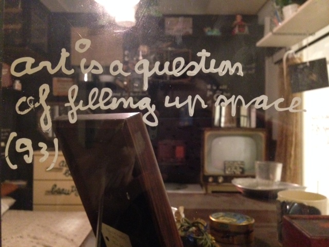
For Fluxus artist Ben Vautier typography was key in his art piece Living Sculpture, an artwork that consisted of putting himself and his every-day life on display in a gallery window for 15 days. He included text panels “In his trademark cursive handwriting…. [that] consisted of rhetorical questions and whimsical comments, giving equal importance to everything from the kitchen table to a container of dirty water. ‘Everything that I touch and look at is a work of art,’ reads one of his plaques.’ ” The meaning of this work would be drastically altered without the use and style of Vautier’s writing.


Evelin Kasikov creates hand-made type out of embroidery. Her hand-stitched work is hard to categorize – somewhere between art, craft, and design. Often working in CMYK embroidery thread and making visual jokes about grids and printing processes only designers or printers might think are funny, her visual language is the letterform. She exhibits around Europe and has also done collaborations with Wallpaper and Wired magazines.


All Sources are credited and linked within post. Non-linked sources:
Armstrong, Elizabeth. “Ben Vautier.” In Bits & Pieces Put Together to Present a Semblance of a Whole: Walker Art Center Collections, edited by Joan Rothfuss and Elizabeth Carpenter. Minneapolis, MN: Walker Art Center, 2005.
http://www.designboom.com/contemporary/holzer.html
http://www.wallpaper.com/sex-issue/tart-cards/kasikov-evelin-04-of-04/1239
