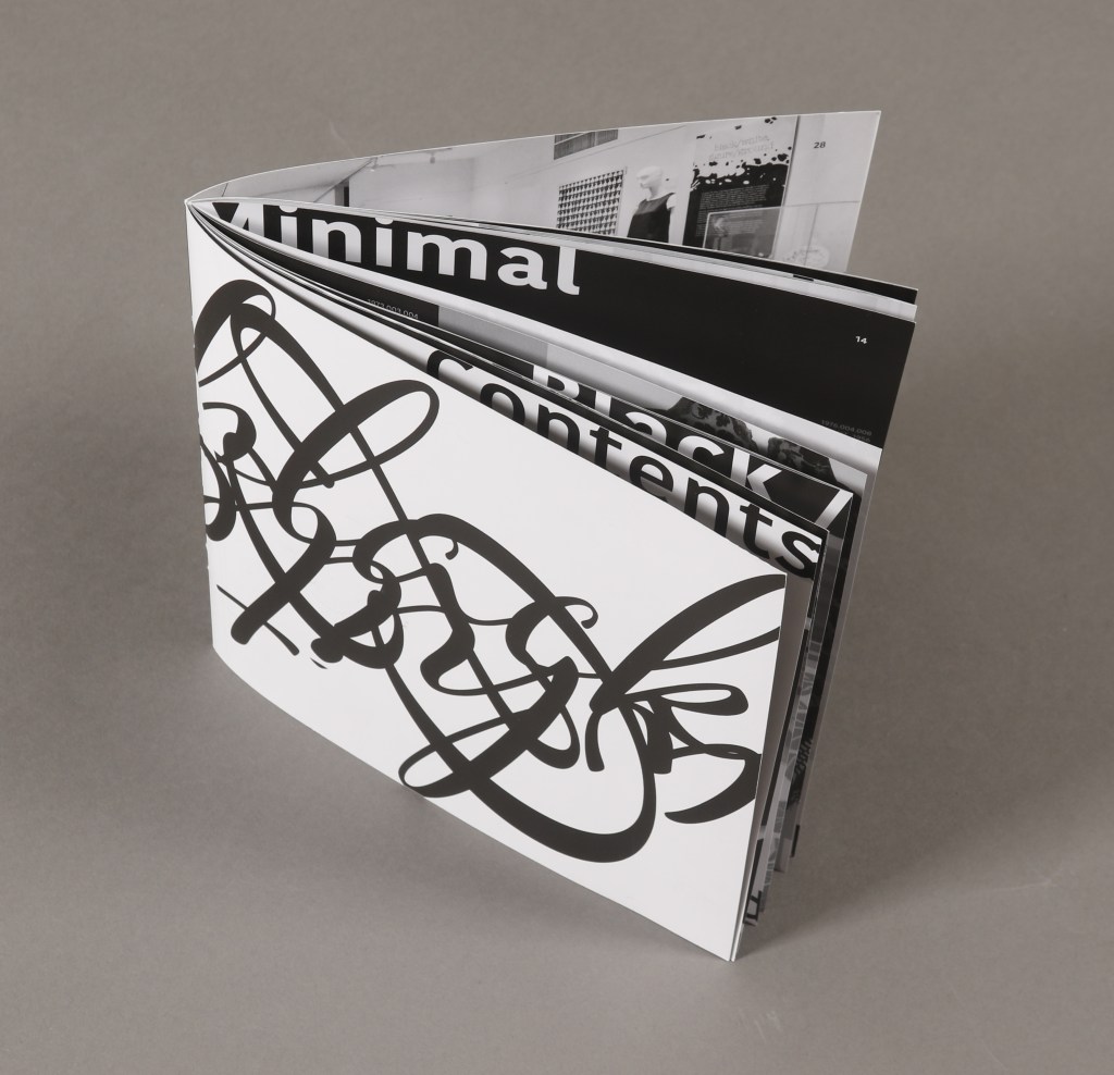
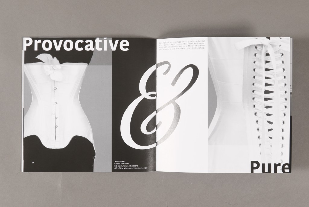
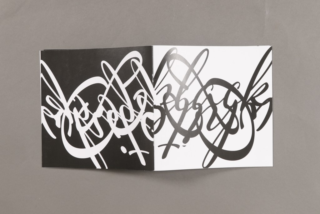
I challenged advanced typography students to create some of their own structures or limitations based around content. The students were given images and copy that they studied in order to develop a typographic design concept for an exhibition catalog. Together we examined examples of books and exhibition catalogs, papers, printing and binding options; models were made; and all design decisions, including the page count and final physical form and materials of the book, were based on communicating the Polarities exhibition. The project taught communication via physical form and materials, combined with typographic design. Students arrived at a wide range of solutions which sparked further discussion of designers giving form to ideas through the creation of an interactive object.