From Uncategorized
Video Demo: Polymer Platemaking for Letterpress with DIY exposure unit
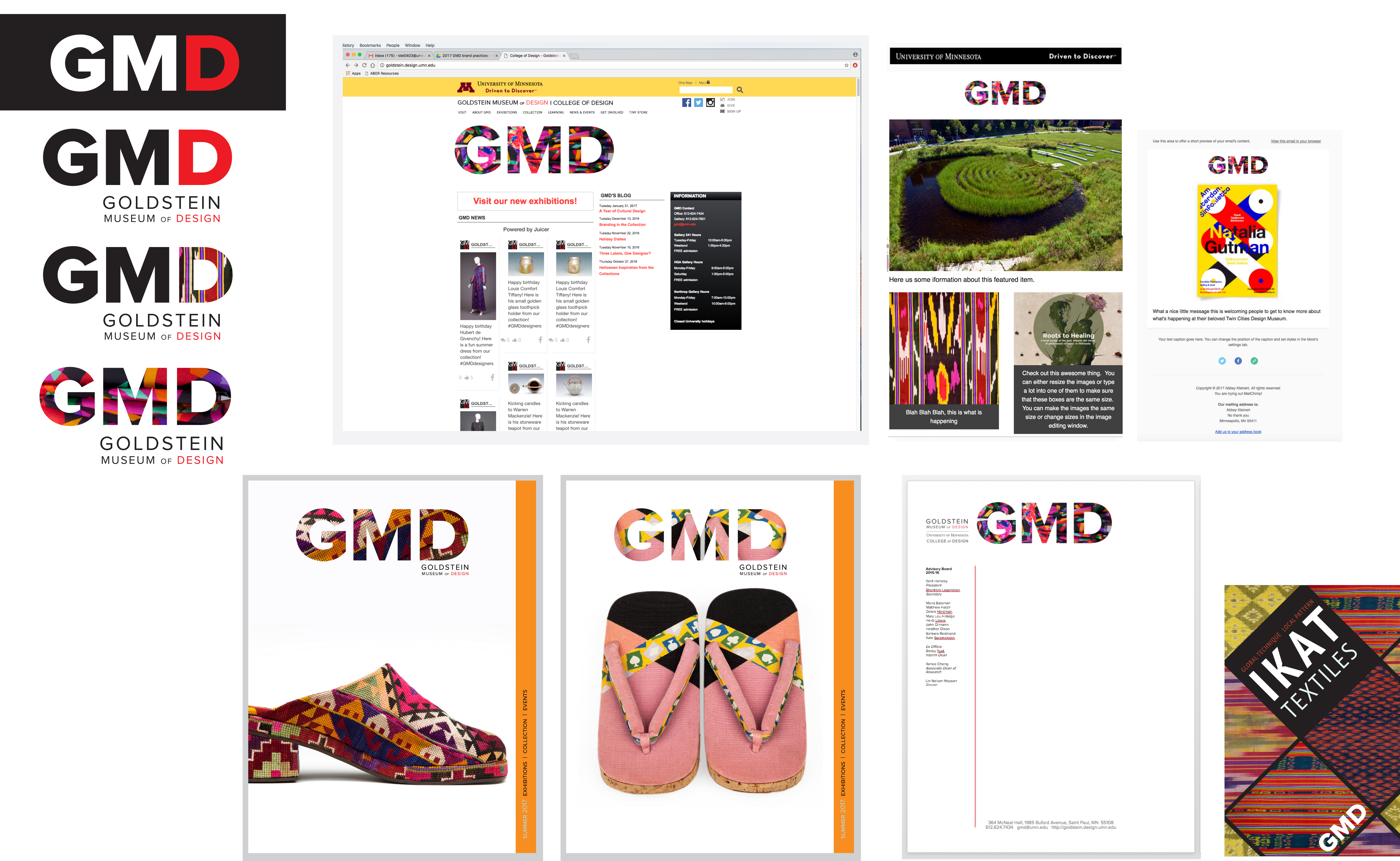
A Favorite Project: The Flexible Identity System for the Goldstein Museum of Design
Museums like the Minneapolis Institute of Art and the Museum of Modern Art are changing how they visually represent themselves and (for better or worse) are leaders in a museum rebrand trend, with a goal to market museums to a wider audience.
After conducting a brand audit with GMD board members Heather Olson and Jessica Huang, I developed a flexible identity system for GMD. The process included identifying GMD’s competitive edge – what special quality it has that others do not. For GMD this is the collection, a strength and focus of the museum’s educational activities.
I knew GMD was not just a bunch of old clothes hidden away in the depths of McNeal Hall, and that the GMD brand should communicate an active and vibrant collection – something to be used as inspiration by designers of all stripes. My design goal was for the GMD brand to unite a historic collection with contemporary perceptions of the accessible museum.
Many things were considered in the creation of the identity system: Olson’s and Huang’s observations and input from staff, collection-inspired graphics that were successful in past communications materials, and additionally, my two years of experience working at the museum and getting to know the ins and outs of its operations.
Along with understanding how to tailor collection images for specific contexts, came the challenge of being an academic museum under the umbrella of two larger institutions – the College of Design and the University of Minnesota. Their graphic standards and expectations also needed to be considered.

The resulting identity system takes advantage of the diverse and colorful database of collection images while allowing creative flexibility for future students working with GMD. The system uses a consistent and recognizable GMD symbol that is flexible because of its openness in changing the “D” (for design) and filling the GMD type with images or textures that correspond to what’s happening at the museum. This system unifies the museum brand by making its communications visually consistent. And the production of communication materials is more efficient because setting up a visual system eliminates the need to design every new communication from scratch.
It’s been a delight to work with the GMD collection as a graphic designer. I encourage future graduate students to be creative with the collection, because graphic design provides a solution for GMD to share its collection in fresh and engaging ways.
The Designer-Museum Symbiosis: Reflecting on Graphic Design at the Goldstein Museum of Design
Graphic Design Inspiration from a Historic Collection
At the Goldstein Museum of Design (GMD) research center at the University of Minnesota College of Design, my office is walled off by a constantly-changing rack of multi-colored, garments. They are plain and extravagant, large and small, long and short, old and new. It is so much more exciting than a boring gray cubicle. I overhear students learning firsthand about the different fabric weaves and knits of these objects. I get to sit in on a surface design talk, examining a wide variety of patterns on scarves and textiles.

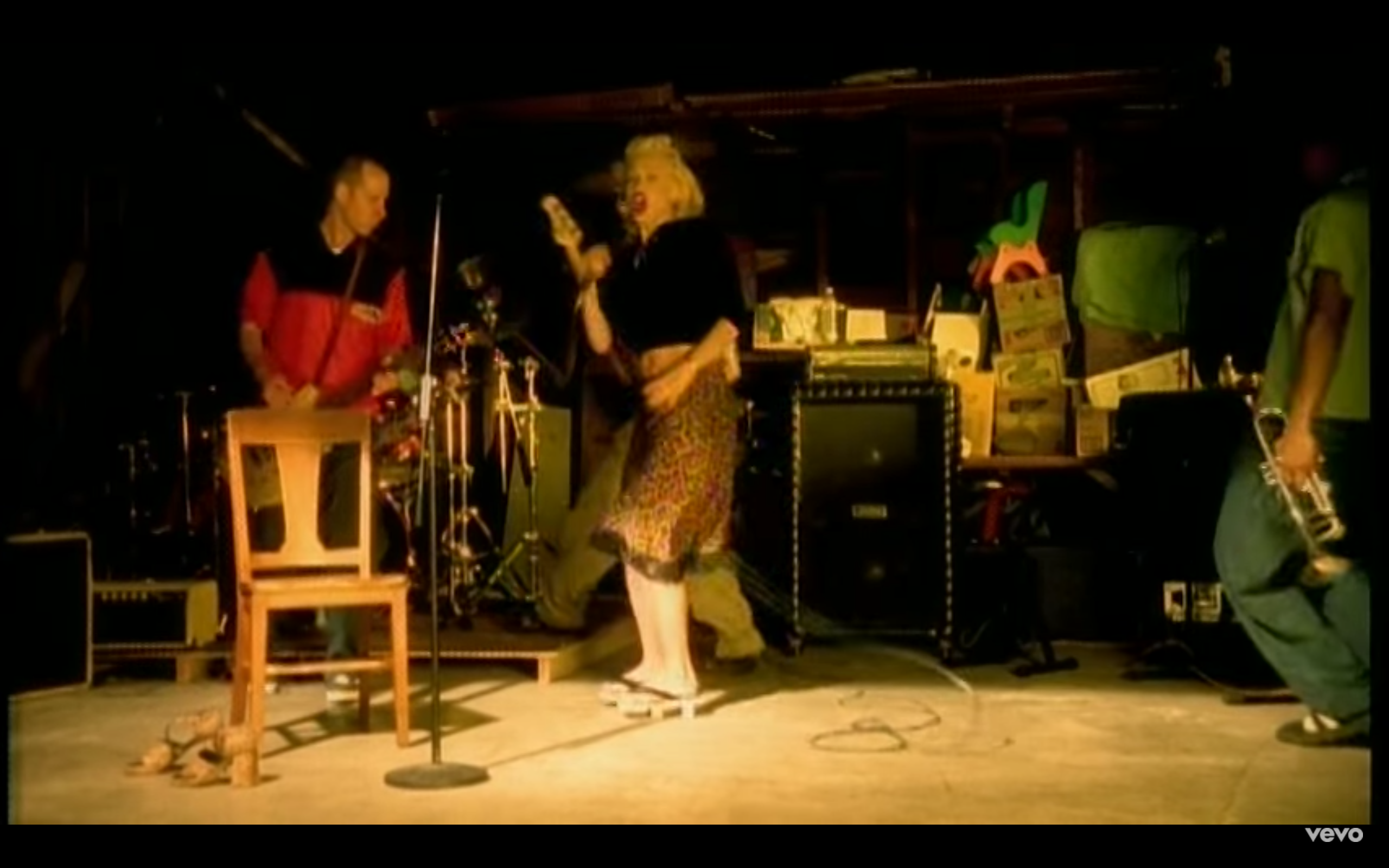
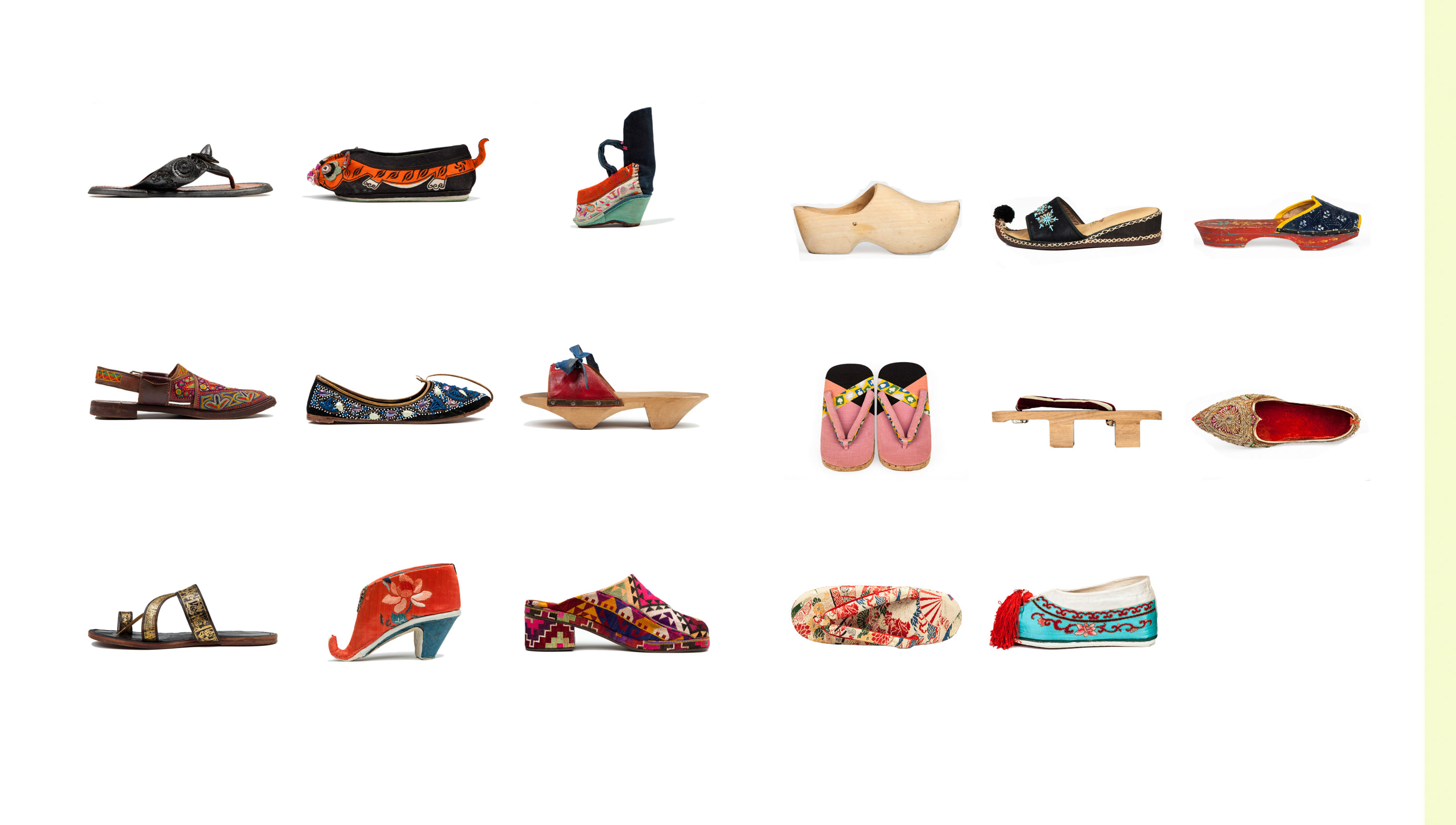
As a result of designing a “taxonomy of shoes” for a GMD magazine spread, I now know that Gwen Stefani is wearing Japanese-style sandals in the music video for “Sunday Morning.”

As a result of my experience working at GMD, I’ve been exposed to the many opportunities for graphic design work in museums. In fact, a large portion of museum work is communication design. From branding and marketing materials, to working with collections, to exhibition design – graphic design expertise makes museums exciting and engaging places. And on the flip-side, museum work is excellent for building a designer’s skill set and presenting creative challenges and meaningful collaborations.
A recent article on The American Institute of Graphic Arts design blog highlighted the careers of graphic designers who left the corporate world to design for the Museum of Modern Art. Eva Bochem-Shur highlighted the expressive work graphic designers do for a museum, like designing a custom typeface for a Tim Burton exhibition. The designers’ further spoke of the benefits of collaborating with a curator and the challenges and rewards of making graphic design work for the scale and physical nature of an exhibition. Of course, MOMA is a larger museum with a budget for top-notch graphic design, but smaller museums can also up their storytelling game by taking advantage of the creative problem solving skills and visual communication expertise of graphic designers.

One of the most challenging and exciting things about my job as graphic designer at the Goldstein Museum of Design, has been incorporating the collection into creative projects. It’s been a bumpy road (failures and frustrations are part of the creative process), but in the end the work has been delightful.
I remember the first time I photoshopped an image from the GMD’s digital collection database. It did not go over well. What I saw as a rather boring graphic with a lot of gray space and a creepy-looking mannequin, the curator and collection assistants saw as an industry-standard, the professional and official way to show the collection, and a photographic style that had been chosen intentionally for the digital collection database GMD had been building out of beautiful portraits of collection objects. As a graphic designer, my brain was occupied with different considerations – questions like: What is the most interesting way to communicate this thing? What are it’s many angles and perspectives? Does the image need to be literal? How much or how little can I show?
We struggled with the disconnect between using collection images for marketing and communication and using them for documentation and research. We came to an agreement that showing a detail of a garment on communications materials was more visually appealing than an image with a mannequin and a gray background. We decided some of the images of object sans mannequin, could stand on their own as a graphic with a white background.


As non-profit institutions, many smaller museums like GMD aren’t branded and marketed like a for-profit business. Perhaps because this kind of branding isn’t necessary for income from grants and public funding or because they simply don’t have the budget or staff to do so. But larger museums (like Minneapolis Institute of Art and MOMA) are leading the way with branding, and (for better or worse) there is a re-brand trend happening that seems to be an attempt to market museums to a larger audience – to make them seem less “old stuffy, and dusty” and more “hip, cool, and contemporary.”
Museum collections are an irreplaceable resource not only for historic and material culture research, but also for creative research. Museums should freely share images from their collections and celebrate the new ways they are creatively interpreted, edited, or photoshopped. The Smithsonian’s Cooper-Hewitt design museum and artist Maira Kalman give a good example in book “My Favorite Things.” And GMD follows suit through collaborations with illustration classes who draw GMD objects, text and images classes who design museum identities inspired by exhibitions of the GMD collection, and MFA students like myself who take on projects that re-imagine visual representations of a collection. When digital collection images are used as inspiration or appropriated in creative projects, it not only brings attention to the museum, but also re-invents the objects, bringing them into current conversations around art and design.

But these collaborations could be pushed further. Inspired by a meeting GMD staff had with UC Davis Design Museum Director of Special Projects and Graphic Design Professor Tim McNeil, I envision a long list of graphic design projects for GMD that would demonstrate its essential role in the University of Minnesota’s design education: collaborating with graphic design students to make a brand book; creating interactive online graphics with collection images, facts, and statistics like the Harvard metalab did with the Arnold Arboretum (http://lifeanddeathofdata.org/); designing creative making activities based on the collection; collaborating with faculty or students to design informal “mini-exhibitions” in the form of a zines, books, catalogs, or dioramas; and on and on. Projects like this demonstrate how a museum is not just a place to store things away to look at every once-and-awhile, but can be the place to think of new ways to use and interpret those things, for interdisciplinary creative collaborations, and creative learning experiences.
It is my hope that graphic designers and museums continue to grow their relationships and collaborations, and that administrators support great graphic design, which is why I’m sharing this post with Museum Hack. Museums have so many excellent resources in both their collections and in the unique knowledge and interests of their curators. Graphic designers can help devise ways to communicate those resources in fresh and engaging ways.

Sources
Kalman, Maira. “My Favorite Things.” Harper Design, a division of Harper Collins, New York, NY, September 2014.
Loukissas, Yanni Alexander. “The Life and Death of Data.” Georgia Tech with Harvard Metalab. Interactive Graphic, Graphic Design Research. http://lifeanddeathofdata.org/
McNeil, Tim., Druesedow, Jean., Young, Denise Ed.D., Goldstein Museum of Design External Review. January 2017. meeting and report
Stefani, Gwen, et al. “Sunday Morning.” Tragic Kingdom. Trauma Records, 1995. Music Video. https://www.youtube.com/watch?v=PiBX-ESFDF0.
Stinson, Liz. “The Fine Art of Designing for a Museum, or Why Designers Quit Their Agency Jobs to Work at MOMA.” AIGA Eye on Design. March 15, 2017, Blog. https://eyeondesign.aiga.org/the-fine-art-of-designing-for-a-museum-or-why-designers-quit-their-agency-jobs-to-work-at-moma/?mc_cid=8491cbde77&mc_eid=c832696323.
Acts of Hope; Responding to Violence with Printmaking in Falcon Heights, MN

Responding to Violence with Printmaking in Falcon Heights
“I’m not brave enough to [break a law and risk going to jail] but I can say rather freely what I want to with my art.” -Corita Kent Corita Kent
Kent, a nun, teacher, printmaker, and non-violence activist believed she could make the world a more peaceful place through art. Her screen prints were part of the Hippie Modernism exhibition at the Walker Art Center, and each of the four times I visited the exhibition (twice alone, twice with students), I was struck by work like Kent’s from the 1960s and 70s that addressed some of the issues my students (and all of us) navigate today – civil rights and racial injustice, violence and war, and communication media shaping cultural perceptions.

I learned about Philando Castile via an official email from the University of Minnesota, signed by the president and vice president of the U, while I was killing time in the computer lab at the U of MN School of Journalism, where I teach a Media Design course. It’s hard to know what to do with messages of violence and fear. It’s hard to know how to help strangers in pain, without causing more pain. “Rule #7: The only rule is work. If you work it will lead to something. It’s the people who do all of the work all of the time who eventually catch on to things.” (Kent and Steward, 2008) When faced with a problem, I often respond by making things with my hands. Inspired by Kent’s screen-printed messages of hope and her collaborations with students, I created a modular system of drawings, textures, and pre-set wood type that could be mashed-up many ways.
Kent “shaped her students to see themselves as artists, world citizens, and people making ‘acts of hope.’” (Kent and Steward, 2008) So I designed a collaborative printmaking lesson for my Media Design class that I hoped would get the students thinking about their perceptions of fear and courage and about all the interesting ways text and image can be combined to shape meaning around those topics. I collaborated with a fellow graphic design grad student and type enthusiast to set up the presses and get the type just right.

The drawings I made and the words I selected were open-ended and abstract so the students could invent their own composition and create their own meanings by experimenting with the different combinations of the typography and graphics. The students experimented with composition and visual communication through layering the drawings and type. I aimed to encourage divergent thinking about the many potential relationships between the words and graphics that could lead to different interpretations of the same imagery.
Experimenting with the layering of screen printed textures and wood type printmaking taught abstract thinking, composition, and transparency. The combinatory nature of printmaking was an excellent teacher. One simple brush stroke texture can hold a world of different meaning depending on how it is printed – brush strokes over the word “fear” hold a different meaning than when they are layered in a different color under the word “courage.”


Each drawing, pattern, texture, or word created different feelings and ideas for the viewer, depending on how it was placed and how it interacted with the the other graphics. One mark or image didn’t always represent just one idea – in one context it meant fear, in another context it feel look beautiful, in another comforting, and in another sad, and on and on. It’s my belief that the hands-on experience of printing graphics and text taught things about context that my words could not.
And that’s where Philando Castile, printmaking, and graphic design collided and became the lesson I struggled to find the words for. Context. Change a color, change a location, change a word, change the style, and the message is altered. Artists, makers, designers, communicators – we have the power to do that.

Bibliography Steward, Jan and Kent, Corita. Learning by Heart, Teachings to Free the Creative Spirit. New York: Allworth Press, 2008. Hippie Modernism. Walker Art Museum. 1750 Hennepin Ave, Minneapolis, MN 55403. December 2015. Corita Art Center. http://www.corita.org. (accessed July 28, 2016)
Letters are Images, too; Typography & Contemporary Art
Type has the unique ability to express an idea visually and simultaneously say it, verbally. Both an explicit statement and an implicit visual, type design has the potential to mean more than the words it spells, reaching far beyond typesetting and magazine spreads. It is this relationship between word and image, and their potential for cognitive disconnect, that gives typography a foothold in the world of contemporary fine art.
The creation of characters has a long history of artistic self-expression – from Chinese calligraphers whose work was (and still is) considered fine art, to the humanist type designers like Geofroy Tory whose work came about during the enlightenment and who was (like many artists of the same time) inspired by the geometry of the human form, to modern-day hand-lettering artists like Job Wouters, (better known as “Letman”).


Amsterdam-based Letman’s hand-lettered work spans industries – from fashion to marketing to animation to art center installations, demonstrating that hand lettering is still relevant. Whereas a good deal of his work references blackletter and traditional sign-making techniques, his collaborators and statements are far from antiquated.


Video above was created by the Walker Art Center during a collaboration and exhibition with Letman.
Jenny Holzer is a contemporary artist whose medium is words. She creates what she has called “truisms”- phrases referencing the human relationship with consumerism and advertising, that she makes into large-scale projections, scrolling LEDs, and works on paper. Holzer’s minimalist aesthetic and an all caps sans serif typeface are what make the the messages in her work stand out, showing how with typographic art, what you say is of equal importance as how and where you write (or type) it.


For Fluxus artist Ben Vautier typography was key in his art piece Living Sculpture, an artwork that consisted of putting himself and his every-day life on display in a gallery window for 15 days. He included text panels “In his trademark cursive handwriting…. [that] consisted of rhetorical questions and whimsical comments, giving equal importance to everything from the kitchen table to a container of dirty water. ‘Everything that I touch and look at is a work of art,’ reads one of his plaques.’ ” The meaning of this work would be drastically altered without the use and style of Vautier’s writing.


Evelin Kasikov creates hand-made type out of embroidery. Her hand-stitched work is hard to categorize – somewhere between art, craft, and design. Often working in CMYK embroidery thread and making visual jokes about grids and printing processes only designers or printers might think are funny, her visual language is the letterform. She exhibits around Europe and has also done collaborations with Wallpaper and Wired magazines.


All Sources are credited and linked within post. Non-linked sources:
Armstrong, Elizabeth. “Ben Vautier.” In Bits & Pieces Put Together to Present a Semblance of a Whole: Walker Art Center Collections, edited by Joan Rothfuss and Elizabeth Carpenter. Minneapolis, MN: Walker Art Center, 2005.
http://www.designboom.com/contemporary/holzer.html
http://www.wallpaper.com/sex-issue/tart-cards/kasikov-evelin-04-of-04/1239
Abstract Expressionist Printmaking – A screenprinted dance backdrop
This collaboration was super-fun! I called it Jackson-Pollack printmaking because I laid out the set pieces on the floor and stood on screens to print-intutive registration to the max. Plus, it traveled and made it into the TIMES! (Yeah, my name in the NYT – yeah!):


